Your Brand Is Either Working or It’s Not: The Pea Green Physio Rebrand. A case study in making the intangible tangible.
Not intentionally. But when your visuals don’t match the experience you deliver, you’re creating friction between what you promise and what people perceive before they ever work with you.
This costs you credibility. It costs you clients. And it hands market share to competitors with sharper brands, even when their results can’t touch yours.
This is the story of Pea Green Physio: a thriving practice with two clinics, exceptional patient outcomes, and a visual identity that hadn’t kept pace with either.
We didn’t just refresh their logo.
We made their reputation visible.
When Reputation Outgrows Identity
Pea Green Physio operates clinics in Cheltenham and Bicester. Their reputation is built on three things:
- Hands-on clinical expertise that shows up in results
- Genuinely warm, personal care (not performative empathy)
- Relief that happens fast—patients feel the difference immediately
Word-of-mouth referrals? Strong. Patient retention? Exceptional. The experience inside their clinics? Exactly what healthcare should feel like.
But their brand identity? Dated. Inconsistent. And completely out of sync with the quality patients experienced the moment they walked through the door.
The gap between reputation and visual presence wasn’t just aesthetic.
It was costing them credibility with every new patient making snap judgments online. Every referral second-guessing the recommendation. Every competitor with a sharper brand stealing attention—despite delivering inferior results.
They didn’t need prettier branding.
They needed their brand to match what they’d already built.
Translating Experience Into Design
When Pea Green Physio came to us, the brief sounded simple:
“We want a brand that feels warm, reassuring, and expert-led. Something that instantly evokes relief and comfort.”
Simple to say. Complex to execute. Because here’s the thing about briefs like this, they’re describing a feeling, not a visual direction. Our challenge wasn’t aesthetic. It was translational.
How do you make relief visible?
How do you design comfort, trust, expertise, and care into an identity system that works across every touchpoint, from their website to their clinic walls to their social media to the intake forms patients fill out? And if we got it wrong?
Every new patient landing on their website would scroll past. Every referral would hesitate. Every competitor with polished branding would steal market share, even with worse clinical outcomes.
The stakes weren’t just aesthetic. They were reputational.
We needed to create:
- Stronger personality — something instantly recognizable, not generic healthcare branding
- A cohesive colour palette — grounded, warm, memorable (and psychologically strategic)
- A clear identity system — flexible enough to grow with them without losing consistency
- A lifestyle-led direction — modern wellness, not sterile waiting room
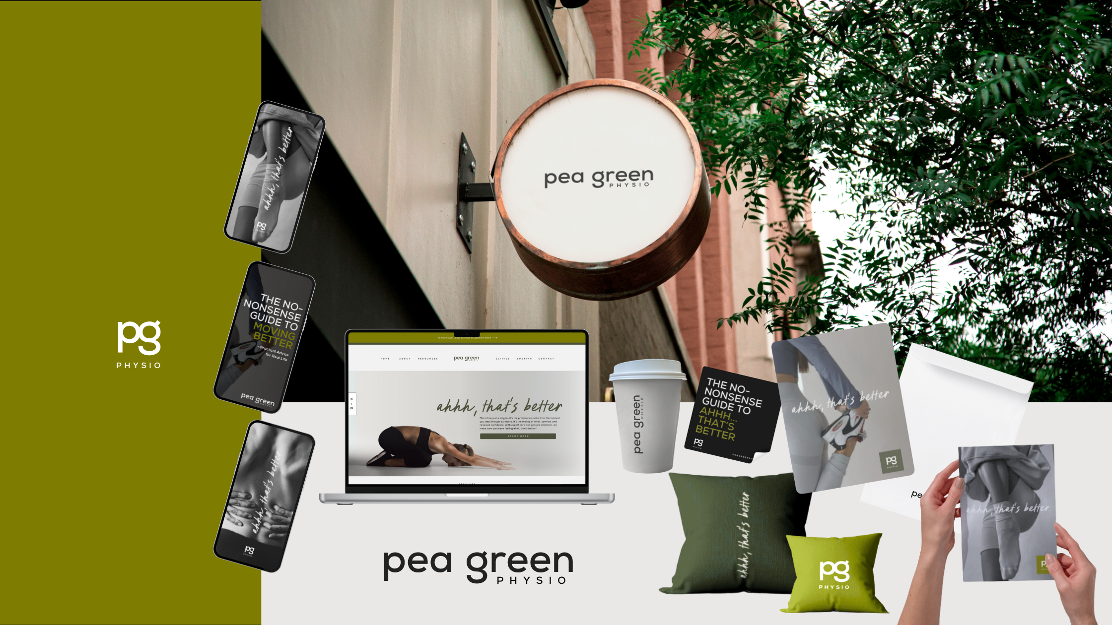
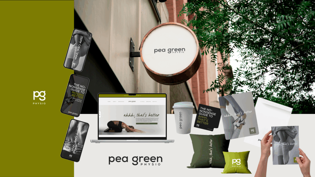
- That signature feeling — “Ahhh, that’s better” made tangible
The visuals had to do heavy lifting before a single word was read. They had to communicate trust, expertise, and the patient experience, instantly.
Designing “Ahhh, That’s Better”
Every strong brand has an emotional anchor, one core feeling that drives every design decision. We distilled Pea Green Physio’s entire patient experience down to three words: “Ahhh, that’s better.”
That exhale. That drop of tension. That moment of relief after treatment, the actual experience every patient walked away with. The feeling that made them refer friends, rebook immediately, and choose Pea Green over every other physio in the area. This wasn’t marketing fluff. This was their competitive advantage, distilled into language we could design around. Once we named it, everything else became non-negotiable. Every colour choice. Every typographic detail. Every piece of photography. Every interior design recommendation. All built around one test: Does this evoke relief?
If not, it didn’t belong. We weren’t designing a rebrand. We were designing that feeling.
The Visual Direction: Wellness, Not Waiting Room
The visual identity needed to communicate three things simultaneously:
- Clinical credibility — expertise you can trust with your body
- Warm approachability — care that feels personal, not transactional
- Modern ease — a lifestyle-led experience, not a sterile medical environment
That’s a fine line to walk. Too clinical, and you lose warmth. Too soft, and you lose credibility. Too trendy, and you lose trust. The solution? Ground everything in natural, human, tactile elements.
We moved away from traditional “medical blue” palettes and sterile stock imagery. Instead, we leaned into earthy greens, warm neutrals, and lifestyle photography that showed real people in real moments of relief and movement.
The typography was clean but approachable. Strong but not aggressive. The kind of visual language that communicates calm authority, not cold perfection or over-designed trendiness.
Every element was designed to make people exhale when they saw it. Because if your brand doesn’t feel like relief, why would someone trust you to deliver it?
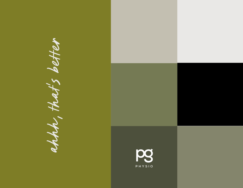
The Colour Palette: Psychology, Not Decoration
Colour isn’t decoration. It’s communication. We built Pea Green Physio’s palette around earthy greens and warm neutrals, colours that evoke natural wellbeing, trust, and comfort before your brain even processes why. Green speaks to growth, healing, balance. It’s grounded in nature, not clinical sterility.
Warm neutrals anchor it in approachability and human warmth. They say “you’re safe here” without words. Together, they create a palette that feels like relief at a glance.
This wasn’t about chasing colour trends. It was about buyer psychology, and creating a visual system that communicated trust, expertise, and ease without requiring your audience to think about it.
Your brand should do emotional work for you, not require explanation. Pea Green Physio’s new palette does exactly that.
What Most Designers Get Wrong
Here’s where most rebrands fail: They prioritise looking modern over feeling aligned. They chase trends instead of translating experience. They give you a prettier logo, some new fonts, and a mood board, then call it transformation. But your brand still doesn’t communicate trust, expertise, or the experience you actually deliver.
That’s not branding. That’s decoration. A rebrand that works doesn’t just refresh your visuals, it makes your reputation visible. It does heavy lifting before you ever speak. It filters out misaligned clients and attracts the right ones. It turns your website into a sales tool, not just a digital placeholder. It gives your team clarity on how to show up consistently across every touchpoint.
And most importantly? It closes the gap between what you promise and what people perceive, so your ideal clients say yes faster, with less convincing required.
The Outcome: Professional, Warm, Human
The rebrand delivered precisely what Pea Green Physio needed: a visual identity that finally matched their patient experience. Professional. But warm. Modern. But human. Clinical. But comforting.
The new brand consistently communicates:
- Trust — through grounded colour choices and clean, confident design
- Expertise — through clear typography and authoritative tone
- Relief — through lifestyle-led imagery that shows feeling , not sterility
- Care — through warm, approachable visuals that invite rather than intimidate
- Movement & Progress — through dynamic layouts and photography that show transformation
And most importantly, it delivers their signature experience in every single touchpoint: “Ahhh, that’s better.” Their website is now designed to convert browsers into bookers. Their social media attracts aligned patients. Their clinic interiors reinforce the brand promise the moment someone walks in.
The rebrand didn’t just make them look better. It made their reputation work for them.
Your Brand Is Never Neutral
It’s either reinforcing your reputation or undermining it. There’s no middle ground.
If your visuals don’t match the caliber of work you deliver, your ideal clients feel that disconnect, even if they can’t articulate why. They hesitate. They scroll past. They choose someone whose brand looks like what they’re searching for, even if the results aren’t as strong.
Your brand should be doing heavy lifting before you ever speak to a prospect. It should communicate trust, expertise, and the experience you deliver, instantly, without explanation.
If it’s not doing that? It’s working against you.
Every day your brand is misaligned is a day you’re losing opportunities to competitors who simply look more credible, regardless of whether they actually are.
The Question You Need to Ask Yourself: Does your brand reflect the experience you actually deliver?
Not “kind of.” Not “it’s good enough for now.” Not “we’ll fix it next year.” Does it match? Because if the answer is no, or if you’re not sure, that’s not a someday problem. That’s a right-now misalignment costing you credibility, clients, and revenue.
Your visuals are your first impression. Your reputation follows. Make sure they’re telling the same story.
If your brand doesn’t match your reputation, you have two options:
Option 1: Keep losing clients to competitors whose visuals do the talking for them. Watch as your referrals hesitate because your website doesn’t reflect the experience you deliver. Stay stuck in the gap between “we’re really good at what we do” and “why isn’t that translating into growth?”
Option 2: Fix it.
I help established businesses turn their reputation into a visual identity that attracts, converts, and elevates, without losing the essence of who they are in the process. No trendy redesigns that feel like someone else. No surface-level refreshes that miss the point.
Just strategic, psychology-driven branding that makes your reputation visible, so your ideal clients say yes faster, with less convincing required.
Ready to close that gap in 2025? Let’s work together >
Related Articles You Might Like:
- How to Know When Your Brand Needs a Refresh (Not a Full Rebrand)
- The Real Cost of Misaligned Branding
- Why Your Brand Should Feel Like Your Best Sales Conversation
